Responsive Website Design
BALANCING KNOWLEDGE WITH DIGITAL
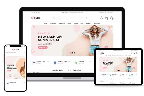
The use of mobile devices is growing at an astronomical pace to surf the web, but unfortunately, not many websites are optimized for all devices. Mobile devices always have different display sizes and require a different approach to how content is laid out on the screen.
A multitude of various screen sizes exists across phones, tablets, desktops, game consoles, TVs, and even smart-wearables. Screen sizes are perpetually dynamic, so it is important that your website will adapt to all screen sizes. Tridots Tech makes the impossible possible with the responsive designing solution.
Why you Need Responsive design?

Increase conversion rate
We offer online design services tailored to business.

Improved SEO
Rich-featured websites are created with perfection.

Reduce Cost
Your dream to sell products online is successful with us.

Social Media coverage
We develop apps that connect you with customers quickly.
